Table of contents
In a world dominated by digitization and numerical data surrounding us from everywhere, the ability to effectively visualize and understand this data is extremely important. This is especially important when we want to spend our money in the most efficient way. This is where Google Data Studio comes in, allowing users to easily create reports that not only present data in an attractive way but also provide deeper understanding and insight into the phenomena under study. From the following article, you will learn the most important things about Google Data Studio and see how simple it is to create a basic report.

Google Data Studio or Looker Studio?
Before we begin, we need to clarify one thing: Google Data Studio is the old name of the tool we now know as Looker Studio. The change was made in 2022, but the tool itself hasn’t changed much since then. I will use these names interchangeably in the article.
Why use Google Data Studio?
Google Data Studio has several significant advantages that contribute to its popularity and usefulness in the data analysis industry. First and foremost, it is a free tool that allows you to easily access and explore its capabilities without incurring additional costs. In addition, Data Studio offers a simple and intuitive interface, making it easy to use even for those without deep technical knowledge.
Another advantage is the wide range of connectors and plug-ins available, allowing you to import data from various sources. Thus, you can easily combine data from different platforms, such as Google Analytics, Google Ads, Facebook Ads or Salesforce, and create comprehensive reports integrated with multiple data sources.
It’s also worth noting that Google Data Studio enables the creation of interactive reports, allowing recipients to explore the data independently. Through filtering, tabs or dynamic elements, users can customize the report’s view according to their preferences and get more detailed information about the data they are studying.
Another major advantage is the ease of sharing and collaboration. Google Data Studio allows online sharing of reports, so anyone with permission can see and interactively use the reports. You can also schedule automatic data updates, ensuring that reports are always up-to-date and available to the entire team.
Not to forget the ability to personalize and design reports. Google Data Studio offers many tools and options that allow you to customize the look of the report to your own preferences and needs. We can change colours, fonts, report layouts, and much more to create professional-looking and consistent reports that align with our brand image.
Data in Looker Studio
To create reports, we must have a basis, namely data. Thanks to them, we will be able to create tables, charts or other statements that will help us interpret them.
Data.
What data can we import into Google Data Studio?
Simply speaking (and being completely honest) it’s almost all of them. Earlier, I mentioned the large number of data connectors. Thanks to them, we don’t need to prepare data for presentation in Google Data Studio beforehand. The most important data sources from which we can import data into GDS for free are:
- Google Analytics
- Google Ads
- Google Sheets
- BigQuery
- AppSheet
- MySQL
- YouTube statistics
- Search Console
and many other sources related to Google.
In addition, Google’s partners have provided more than 800 connectors to help connect data from platforms such as Facebook, Pinterest, Semrush, Twitter Ads, etc.
If you use your own tool, whose data you export in an unusual way, you can also use it in the report you create. However, it is important to format them beforehand into a .CSV file, in which commas separate the values.
How to add data to Looker Studio?
After creating the first report (which I’ll describe below), you must select the „Add Data” button in the top menu. When you do this, a window will expand to select the source you want to use. If you are creating a report from scratch, the window will display itself when you create it.
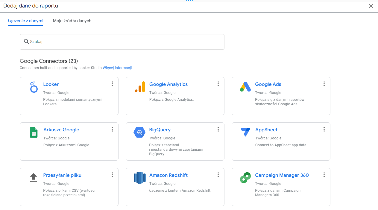
The most common sources of choice in the SEM industry are Google Analytics and Google Ads, so we’ll choose the latter option for the sake of the example. Pointing to Google Ads, the next window will ask us to indicate the advertising account from which we want to use the data. Once we’ve done that, all we have to do is click the „Add” button. In this way, we will be able to use all the parameters that were available, for example, in Google Ads reports
It is worth remembering that the report in Looker Studio should be created in the same account where you use Google Ads or Analytics. Otherwise, using the data in the report will not be possible.
How to create the first report in Google Data Studio?
As with Google-related services, the account is the same as Gmail, Google Ads, YouTube, and other tools. If you are interested in the topic of reports, I assume you have such an account. If that is indeed the case, then all you need to do using it is log in to the Looker Studio panel
The next steps after logging in are:
- Click on the „+ Create” button to create a new report without a name, and a window will appear asking you to indicate the data source.
- This indicates the data source, as described earlier in this article.
- Configure the data in the report as needed using the top menu and the data selection box on the right.
Discussion of the interface
The report creation panel is divided into five key elements.
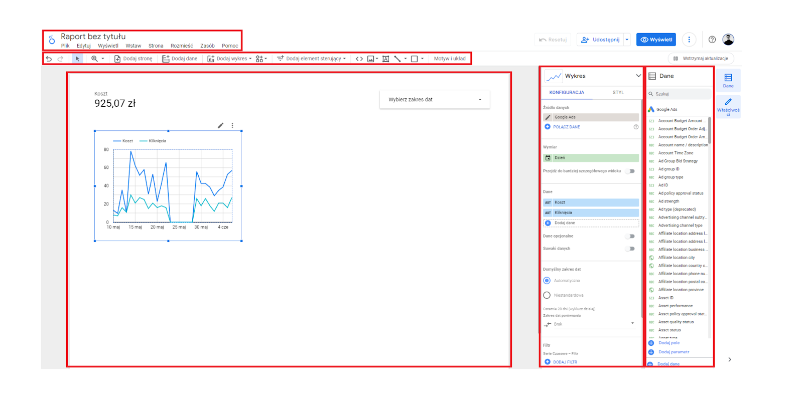
In order, we have:
- Menu regarding the file.
- Menu regarding report elements.
- The working area where we design the report.
- Column regarding the settings of the selected item.
- The column shows all available data, parameters and values we can present in the report.
File related menu
Most of the options we can select here are standard Google file editing options. Only worth noting are the individual items that are often used in Looker reports:
- File -> Theme and layout: the option allows us to choose one of the predefined graphical styles of the report and set the page layout, its orientation and size.
- Insert ->: the place from which we select almost all the elements we want to present in our report. In addition to different types of charts, graphs or tables, we can also select elements such as a text box, images, various shapes or checkboxes. After selecting an element, we have to click on the design field, move the element to the place we want, and then customize it using the configuration field.
- Page -> New page: Your report will have several pages, for example if we want to present data from different periods and channels or prepare a more extensive report. In this menu, we can duplicate a page, which we will modify.
Report elements menu
Similar to the menu above, most of the elements are intuitive. The cursor will let us move the elements, the magnifying glass will zoom in on them, and the arrows will change the report page. It gets more interesting further down the page when elements specific to the Google Data Studio environment appear:
- Add data: The option described in a few paragraphs above allows you to import data into the report.
- Add chart: the basis of reports – the better the charts, the easier the data will be to interpret. We have many charts to choose from, from the simplest to the most specific.
- Community-created visualizations: the menu allows you to select components external developers develop. The option is in BETA (as of June 2023) and should be used cautiously.
- Add control element: also an important option, allowing us to add an element to the report, the clicking (or moving, setting the range, etc.) of which will affect the presented data. The most common one used here is „Date range setting”, which works similarly to Google Analytics or Google Ads. Once we add a „calendar” element and set a date range, all data presented in the report will apply to that period (unless the elements are configured otherwise). We can also add a button that will download the report or change the data source in the report.
Further, we can add elements such as images, text boxes, lines, or shapes. The same is true in the menu at the very top of the page.
Design fields
This is where we put all the elements we want to present in the report. Charts, tables, text fields or simply containers containing values. When designing a report, it’s a good idea to make sure it’s aesthetically pleasing and has a consistent style so that other people to whom your report will go can easily navigate through it. The placement of elements, too, should follow UX principles: for example, the date range selection will be placed in the top right corner like most well-known applications.
Element configuration and style settings
After adding an element to the report, we can configure its content and style.

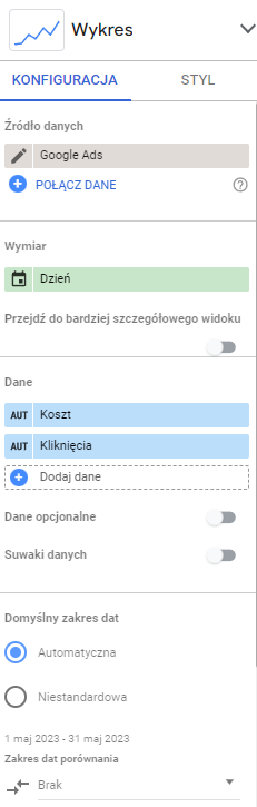
In the line graph example, the content will be:
- Data source: in our case Google Ads, but it will happen that we will use multiple sources for one report. In that case, indicate the one we are interested in.
- Dimension: in simplest terms, this is the category or attribute that groups the data in the chart. In the case of the chart above, this would be „Day”.
- Data: these are the values we want to represent on the chart. „Cost” and „Clicks” are shown above.
- Default date range: setting this option to „Automatic” will use the control’s settings. We can also specify the range ourselves so that the control element will not be affected.
- Comparison date range: here,we can indicate a specific period or compare data to the previous period or the same period in the previous year.
- Filter: sometimes, we do not want to present some data in the report element. Then, it should be included in the filter settings.
We can complete the „Data” and „Dimensions” fields by clicking on the blue plus and pointing to the dimension we are interested in from the list or by dragging from the right column of data. We can configure how the data is presented by clicking the pencil icon. With this, we can set the data format (number, percentage, currency, etc.), the number of decimal places or the name displayed on the chart.
In addition to the element’s content, we can configure its appearance. By switching to the „Style” tab, we have the ability to change the appearance of almost all elements, among others.
- type of chart,
- thickness and colour of the line,
- background and colour of the graph,
- location of labels and axes,
- trend lines,
- grid colours,
- elements of the legend, etc.
Of course, the configuration options vary depending on the element we choose. Some elements allow you to select more dimensions or data, while others only allow you to customize the style.
Data column
The last key element is the „Data” column. Here, we will find all the parameters we imported from our source a few steps ago. We will represent them as a number by dragging them into the working field. We can also use them in tables or charts. It is worth noting that when importing from Google Ads, some data may be named in Polish and some in English. Check both language versions when looking for the parameters you are interested in.
It is also possible to add your own fields, for example, if you use non-standard metrics. To do this, click „+ Add field” and, according to the instructions, complete the formula based on the available data.
Step by step: short version
Looker Studio, or if you prefer Google Data Studio, is an extensive tool. In this article, I’ve only presented the tip of the iceberg to show that it’s not as scary a tool as it may seem from the outside. There will probably be more articles on Looker Studio in the future, but for now, as a recap, here’s an abbreviated plan for creating a report:
- Create an account and add a blank report in the Looker Studio dashboard.
- Select the data source you want to present in the report.
- Add the elements that will present the data to the working field.
- Configure the elements by adding dimensions, data, and other parameters.
- Remember the controls, such as selecting a date range.
- You can share the finished report in the same way as other Google files.
Want to learn more about presenting data? Check out SchoolUp!
Free courses from Google are just the beginning. If you want to grow further by taking 1:1 lessons with Internet marketing experts, sign up for our courses! Level tailored to the student, you choose the scope of learning yourself!
Was the article helpful?
Rate our article, it means a lot to us!
Let's talk!

Hi! I have been involved in internet marketing for almost two years. I click on the computer and spend money that is not my own in such a way that it is most profitable for the owner of that money :) Despite a relatively short presence in the marketing industry, I have dealt with the largest Polish e-commerce companies. At UpMore I am responsible for managing projects including: in Google Ads, Facebook Ads and Apple Search Ads.