Table of contents
Anyone who has ever dealt with marketing knows that data analysis is the basis for planning the future and summarizing past activities. The results that our campaigns achieve are the factor that allows us to draw conclusions so that our future activities are as effective as possible. Analyzing data, even the simplest, is far better than leaving campaigns alone and duplicating mistakes in the future. Although through the development of artificial intelligence, we depend less and less on humans and more and more on algorithms, we should know where to look for data and how to use it. From this article,e you will learn what reports are in Google Ads and how to configure them.

Data analysis – where to start?
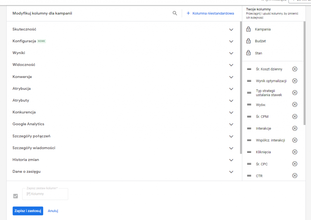
The easiest way to view the results our campaigns are getting is to log into your Google Ads account and go to the „Campaigns” tab. I know most users and Google Ads specialists do it this way. This is a good solution if you want a „quick” look at the most important campaign data, such as number of impressions, clicks, conversions achieved or costs. A helpful feature is the ability to modify columns and save their presets so that you can quickly switch between them. After clicking through the column modification menu, you’ll notice that there’s a whole lot of data: starting with the simplest (like the ones mentioned above), and ending with competitive analysis and adding custom columns.
Custom Columns
There are times when we need to calculate a ratio, index, or other type of data based on columns that are available by default. Some people immediately export the data and import it into Excel or another spreadsheet. However, there is a way to have your own metrics in Google’s ads panel. We are talking, of course, about custom columns.
To create such a column, we need to go to modify columns and then select the blue link at the top of the view. After clicking on „+ Custom Column” we will be taken to the column wizard.
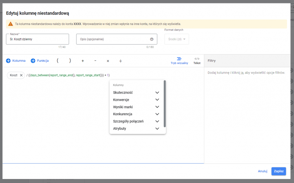
In the text box, we enter a formula similar to the one we would use in a spreadsheet. The difference is that instead of referring to specific cells, we refer to the contents of other columns. When creating a formula, we can also use the function library, which contains all the logical operators, date stamps, arithmetic functions, etc. Once we have created a column, we need to add it to the selected set of columns (we can also set the set as the default, and then it will be automatically displayed when we log into the account).
However, I do not know of any specialist who has 100 per cent abandoned the classic sheets. Modifying columns is a useful feature, but when you need to focus on more data, the Google Ads panel is not clear enough. I recommend analyzing more advanced data in programs designed for this (Atlas, Looker Studio / Google Data Studio or just the simplest Excel). You can also use built-in reports.
Reports
Analyzing more data is essential for more extensive accounts. Comparing target groups, campaign types, devices on which ads are displayed, and the impact of weekends on performance is just the tip of the iceberg. With Reports, we can do this from the Google Ads dashboard or export the data further.
Reports are divided into three types:
- Pre-defined reports (Dimensions)
- Reports
- Panels
There is also a fourth type concerning video advertising, but it is only available for download.
Pre-defined reports (Dimensions)
As Google is accustomed to, some features are available automatically, and some we can customize. Pre-defined reports are a collection of pre-defined reports that present the data most often analyzed by users.
To access the reports, log in to your Google Ads account, then from the top panel, select the bar chart icon and sign as Reports. Once the list is expanded, we can point to the report we are interested in.
The report will be displayed on the top panel.
There are dozens of reports, and they are divided into the following categories:
- Basic: containing summaries of costs and results of campaigns or groups of ads. Describing audience segments and landing pages.
- Hourly: showing the results of an entire account by day of the week, a specific period or time of day.
- Conversions: grouping results by category, source or action.
- Targets: relating to campaigns to which the user has assigned a specific label.
- Locations: running based on the location component, compiling results depending on the distance to the stationary store.
- Product: applicable only to accounts whose purpose is to sell (e-commerce). It divides products by category, brand, identifiers and other attributes.
- Components (older version): compiling the results achieved by components, such as explanations, links to subpages, information extensions, etc.
- Resources: the same as above, regarding the new version of ad extensions.
- Analysis of auctions: showing the share of our ads in different types of all ads on the Google network.
- Display/video ads: indicating effectiveness among content on a given topic or among specific audiences or on specific pages.
- Other: indicating free ad clicks or destinations for pMax campaigns.
Commonly defined reports allow us to draw conclusions to optimize campaigns more effectively. The simplest example here would be the Hour: days of the week report. By checking on which days the budget is used 100% or which days generate more revenue, we can adjust the ad display schedule or create a rule to increase the ad budget on specific days This will ensure that we do not miss out on potential benefits.
It may also happen that the reports created by Google do not provide us with information on certain topics. Then, it is worth using them as a basis for creating a customized report
Custom Reports
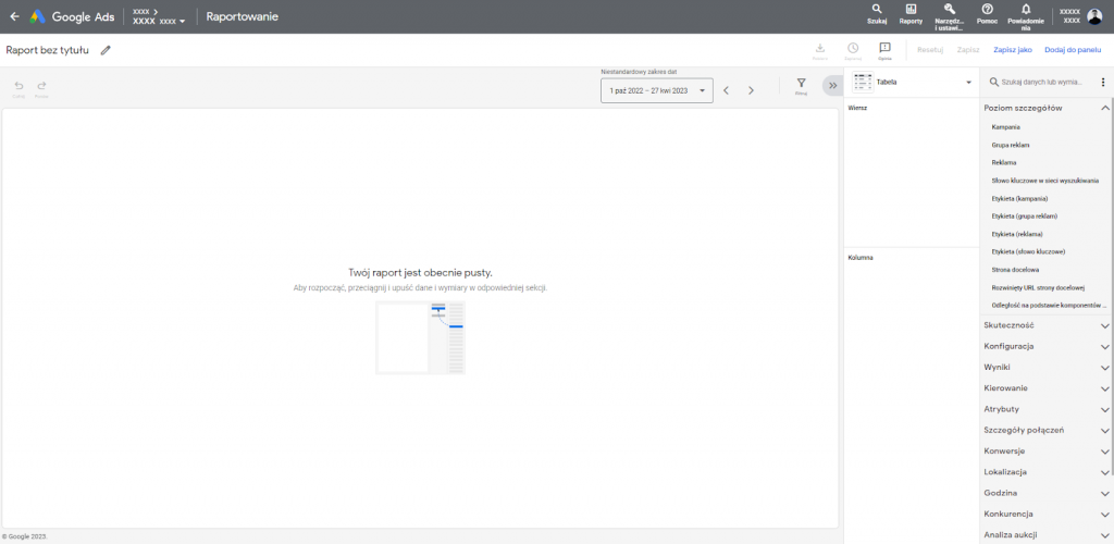
Creating a custom report is intuitive. After logging into your account, you click the same icon as in the previous case. Then, after going to Reports, we select the blue button on the left „+ Custom”. The wizard allows us to indicate one of seven report types:
- Table;
- A table in the form of a tree;
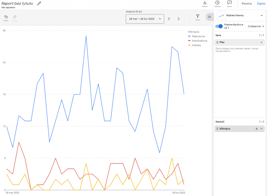
- linear graph;
- column chart;
- bar chart;
- circular graph;
- point graph;
After selecting the type, you will be taken to the report wizard, divided into two key parts. The first, occupying the main part of the screen, is the report preview. On the right side, you will find a panel where you indicate the data or dimensions you want to present.
There are dozens of data and dimensions, so Google provides a search engine that makes selecting the information we are interested in is easy. The data is sorted into 16 categories, the most commonly used: level of detail, effectiveness, results, attributes and conversions.
Some dimensions can also be filtered. To do this, after adding data to the report, expand the respective tile by clicking the triangle symbol. You can apply a filter, use conditional formatting, or sort the data here.
The selected data will be presented differently depending on the type of chart we indicate. Some types of data presentation also have technical limitations.
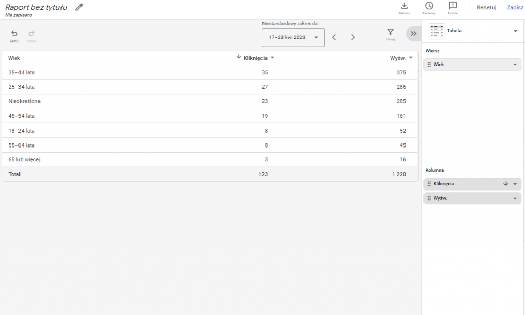
Table and table in the form of a tree
The first type is the classic table we know, even if only from the campaign preview I wrote about at the beginning of the article. The tree allows us to expand the level of detail, for example, when we want to see what groups of ads the campaign contains and what results they achieved. For both tables, we have no limit on the number of dimensions we will present in columns and rows.
Linear and dot plot
The linear graph is a convenient and clear way of presenting data in time-based terms. However, it only allows you to analyze one data series and a maximum of two values at a time, so it is not useful for more extensive analysis.
Point is its counterpart, except that we present data in one series on two axes, X and Y.
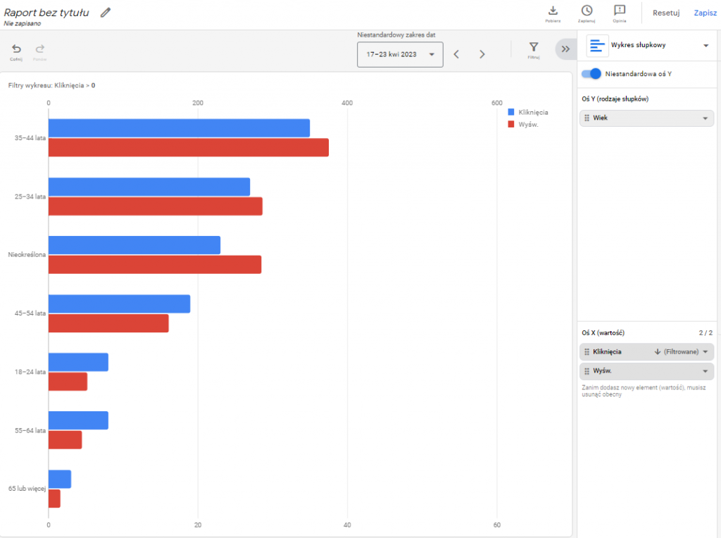
Bar graph
We need to start by noting that there are four bar chart formats: classic, grouped, cumulative, and cumulative to 100%. They all differ slightly in the way the data is presented. We present the data on the Y axis (bar types) and on the X axis (value). The axis presenting the value is limited to a maximum of two different values.
Column chart
Situation 1:1 as for the column chart. Also four types, also limited to two values presented simultaneously.
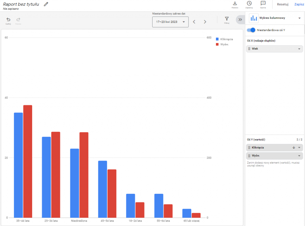
It is worth mentioning, however, that not all combinations of columns and rows are allowed. Some columns do not interact with other columns and rows, so in that case, we are left with exporting data and analyzing it in external programs.
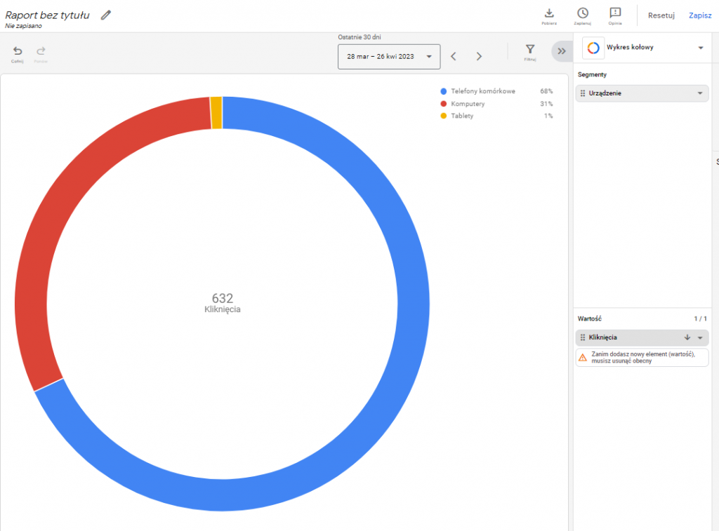
Wheel chart
The last type is the pie chart, which is a simple way to present data. Each chart can represent one value, while segments can theoretically be added. Theoretically, because most of them are mutually exclusive and cannot be compared simultaneously.
Panels
Panels are a graphical way to present reports, notes and summary statistics simultaneously. You may notice some similarities if anyone has used Google Data Studio (Looker Studio). The panel wizard consists of a dozen or so „cells” that we can fill in with one of three types of data:
- Note: a freely fillable text field.
- Report: predefined or custom-created and saved by us.
- Summary statistics: information about the value of the selected indicator.
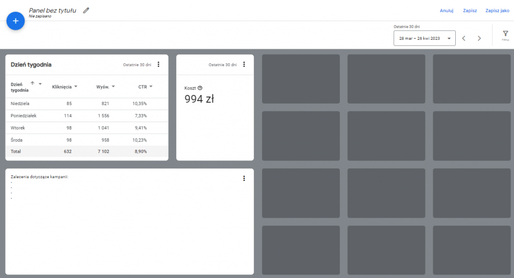
Panels, like reports, can be saved to an account so that you can quickly view them without having to configure them every time.
Data export
There are many ways to analyze and present data in Google Ads reports. However, this does not mean we will do all, even the most complex analysis. For this purpose, we usually use external software. We can use integrations between some systems and Google Ads, but not all of them are adapted to this kind of connection. Then we have to download the data manually and then import it into the program. The easiest way to do this is from the table report. After selecting the appropriate columns and rows, just click the „Download” symbol at the top right of the screen. We can export the data in the following formats:
- csv
- Excel .csv
- tsv
- xml
- csv.gz
- xml.gz
- png
And directly to Google Sheets.
Is it worth using reports on Google Ads account?
Google Ads reports are certainly a feature that facilitates an overview and basic analysis of the results that our campaigns or ad groups are achieving. Unfortunately, they do not provide more complex analysis, which can be crucial on accounts with dozens of ad campaigns. It’s worth using them for day-to-day work, but I recommend using more powerful tools for analyses that cover a broader time horizon and a larger amount of data.
Was the article helpful?
Rate our article, it means a lot to us!
Let's talk!

Hi! I have been involved in internet marketing for almost two years. I click on the computer and spend money that is not my own in such a way that it is most profitable for the owner of that money :) Despite a relatively short presence in the marketing industry, I have dealt with the largest Polish e-commerce companies. At UpMore I am responsible for managing projects including: in Google Ads, Facebook Ads and Apple Search Ads.